UX writing
guidelines
In a 6-week sprint, I laid the groundwork for UX writing guidelines that can be added to the Grafana design system.
It is a strength of open-source that anyone can contribute and is empowered to be part of the project. However, the challenge is to transfer all the needed knowledge to new contributors. Grafana uses a virtual design system to transfer knowledge. But currently this design system is not always the most detailed, and regarding writing there are no instructions and guidelines at all. So every contributor has to "wing it", and even for UX designers there is no knowledge base to help make writing decisions.
As part of the Grafana UX team, I have wanted to improve our design system and UX writing for a while. So I took this opportunity to start introducing writing guidelines into the design system, so that they can be found easily and will help people contribute to Grafana in the best way.
Used skills
- User interviews
- UX Research
- Journey mapping
- UX strategy
- Information architecture
- Mockups
- UX writing
- Content scorecards

“We have designed lots of features based on educated guesses, not based on guidelines or research.”
– A Grafana Labs people manager
“I would like to point people to resources and links instead of repeating myself.”
– A Grafana Labs technical writer
To solve these problems, I started this project to introduce guidelines for UX writing to the design system. This meant researching and defining
- the product voice
- how our UX writing should align to and sync up with marketing and technical writing
- what information needs to be included in the guidelines
- how to inform contributors without information overload
- a place where contributors actually look at the guidelines.
This meant identifying and interviewing various stakeholders to research the different key aspects of the project.
UX Team
Using and maintaining the Figma version of the Design System.
Developers
Using and maintaining the live code version of the Design System (Storybook). Sometimes design interfaces without UX support.
(Tech and marketing) Writers
The people who need to explain and advertise new features. They already help with UX writing.
Design System Knights
UXers and devs – specialists in creating, documenting, updating components
exploratory research
Interviews
- compiled research questions for tech writers and marketing
- conducted 6 interviews
Participants
- tech and marketing writers (4 interviews)
- UX designers (2 interviews)
Competitive research
- analyzed 3 other content guidelines / design systems
- how to inform contributors without information overload
- a place where contributors actually look at the guidelines.
Research insights
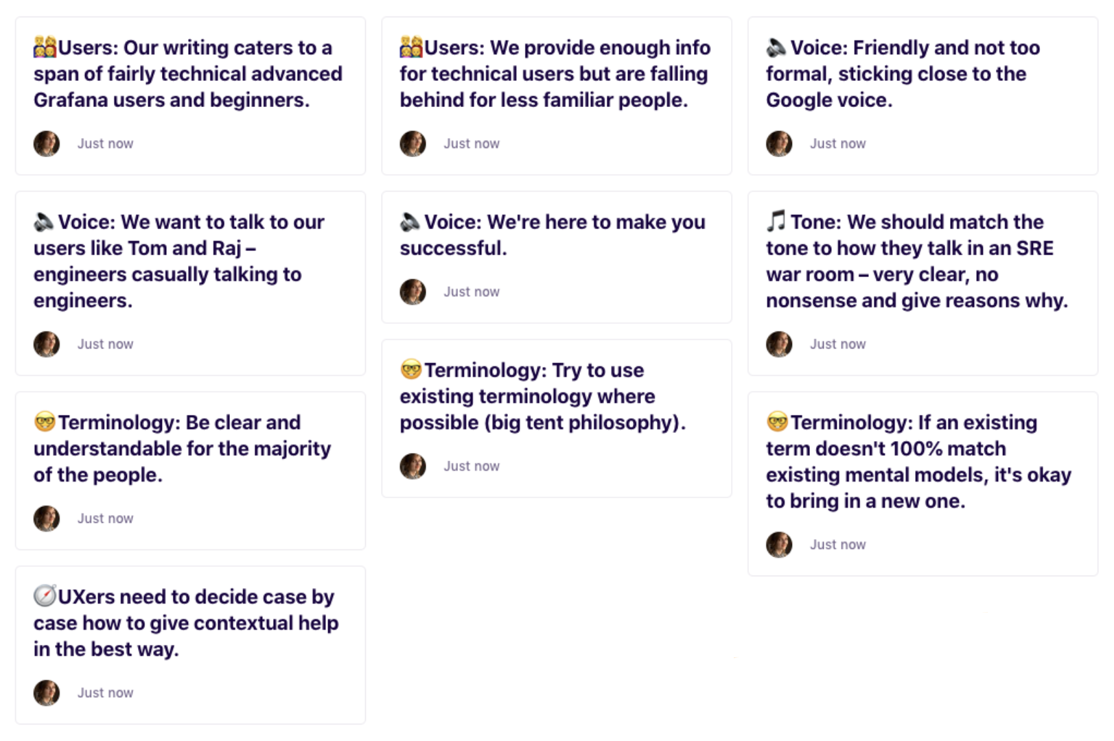
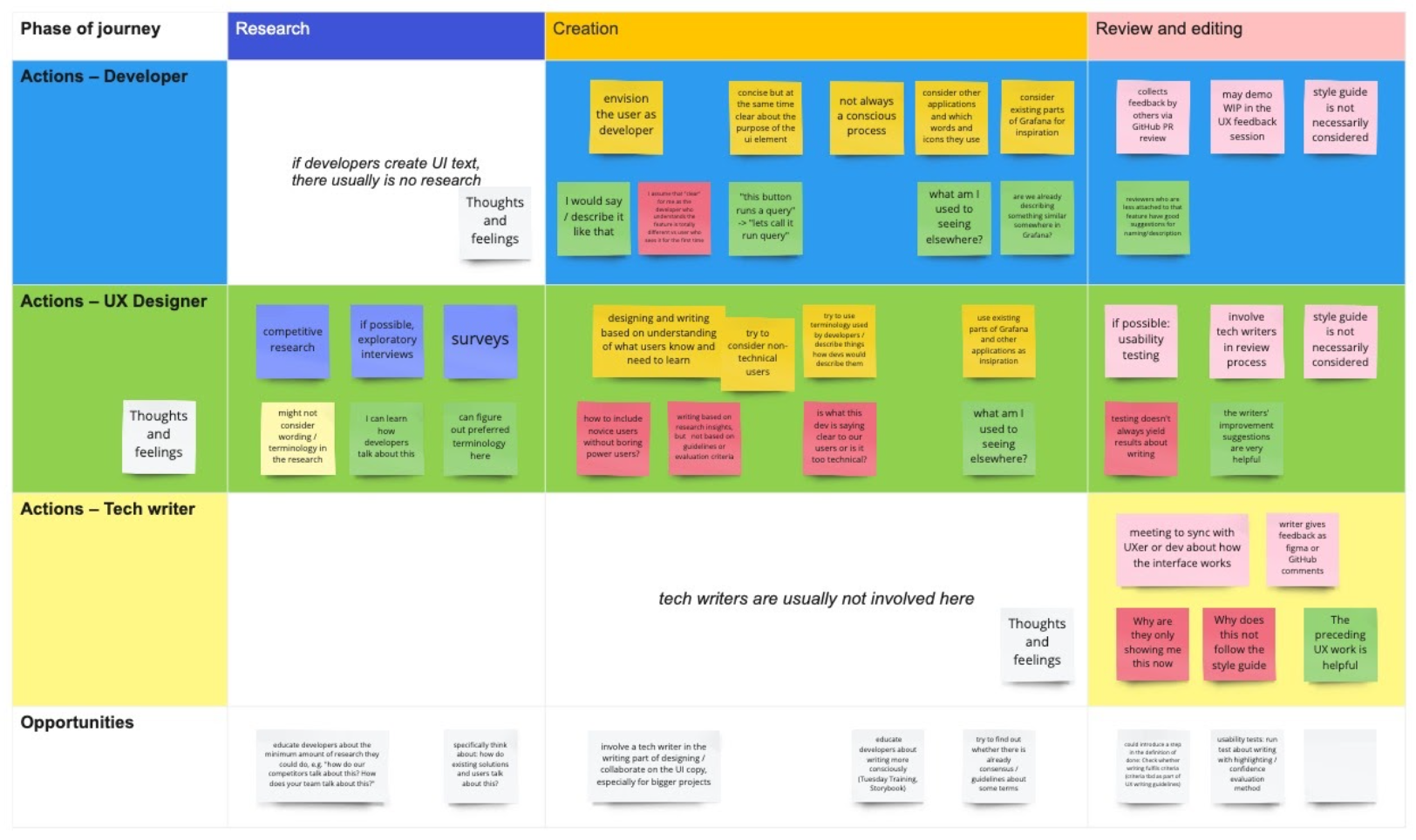
Journey map
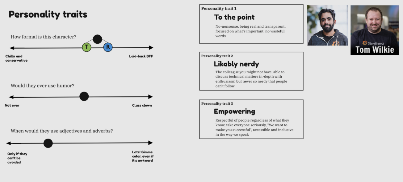
“How do our representatives speak? Tom, Raj. The technical content is on point and solid, but the way they communicate is very personable and open.”
– A Grafana Labs technical writer
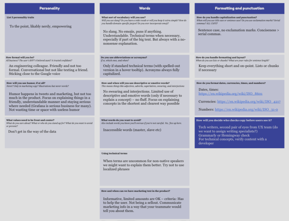
Grafana hasn’t had clear brand guidelines or an existing voice and tone definition. For this project to make progress and not get stalled by branding discussions, I decided to take a grassroots approach.
I defined a product voice personality as well as how the personality affects words, style and punctuation.
information architecture
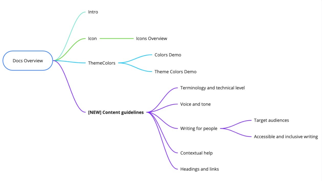
With the interview insights and competitive research results, I came up with a way to include the new writing guidelines in the design system's existing information architecture.
content scorecards
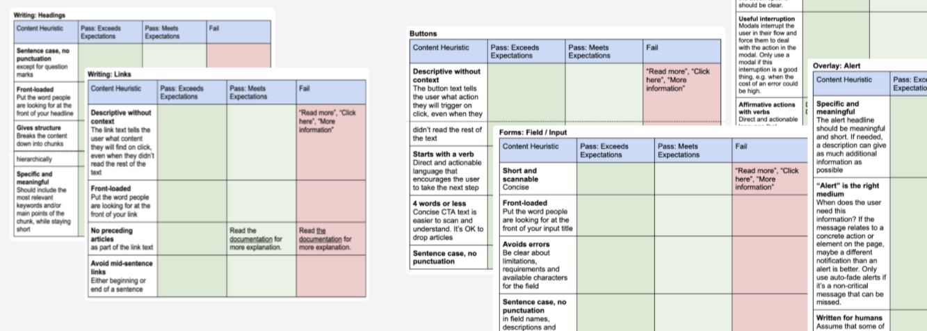
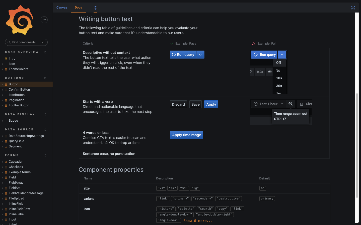
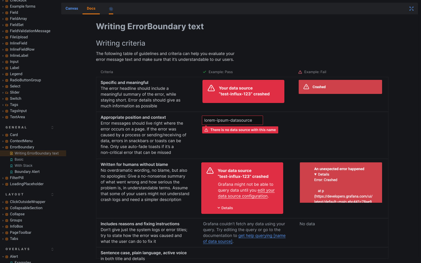
I created criteria for content scorecards and drafted some examples for the most important types of recurring content like buttons and error messages.
wireframes and mockups
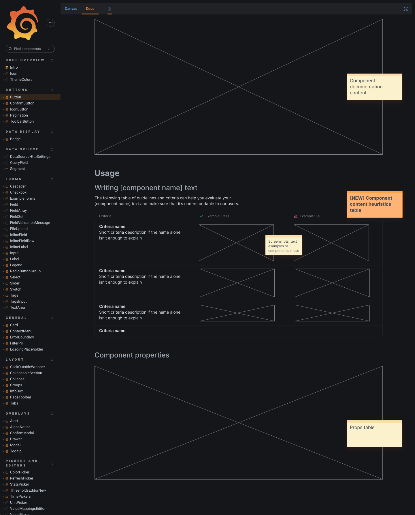
One of the key questions from the research was: How do we make people look at the writing guidelines? So I decided to put the guidelines in a place where contributors look the most: Directly above the props table of the design system. In order to keep the guidelines simple and concise, I also decided to limit each scorecard to a maximum of 4–5 criteria to follow.
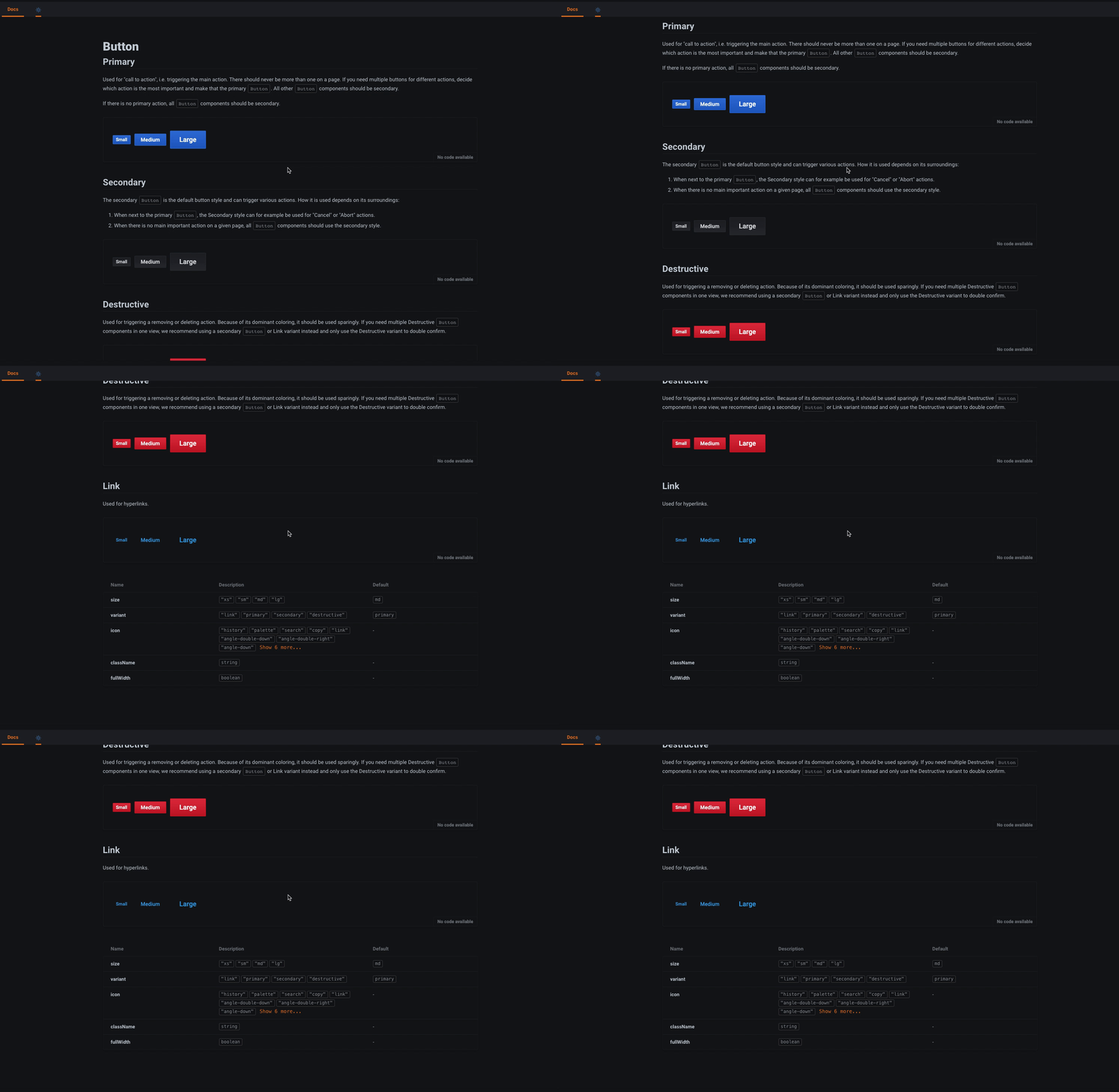
The design system before my additions
The wireframe
Example scorecard: Button
Example scorecard: Error message
This project was just the starting point – the guidelines aren't fully written and haven't been reviewed or implemented. The Grafana design system will continuously be expanded, and the UX writing guidelines will be added in the process.
