next level
moni
toring
Redesign of an open source monitoring platform's UX: I identified possibilities to improve, coming up with mockups and a modern appearance in a 3-workday sprint.
Monitoring is a field where good information design and user experience is especially important. As a design challenge, I analysed an existing open-source monitoring tool and made suggestions for design iterations and improvements. The analysed monitoring tool had several areas where it could be improved: conciseness, navigation, usability and customizability of graphs, information hierarchy, etc. Furthermore, there was a general challenge of combining an overview of your server-node network with the single node dashboard.
I could spot issues on the few most important screens immediately and created annotated versions as a reference for my improvement suggestions. After conducting a user interview with a developer who regularly uses monitoring tools, I started to ideate and formulated „how might we“ questions. I focused my solution ideas on these questions in order to solve the most pressing issues first and keep focus on what's most important.
Used skills
- Design Thinking
- User interview
- Information architecture
- Wireframing
- UI Design
- UX Research
- UX Analysis
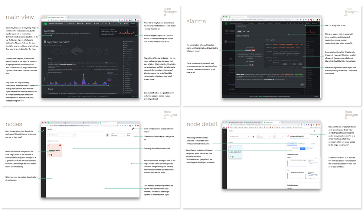
There were many issues with the UX concept of this monitoring surface. Some examples:
- a long non-filterable monitoring page with lots of explanations that could not be hidden
- graphs with confusing controls
- several styles of navigation that did not work together
- two independent systems (single node dashboard vs. nodes overview) that needed to be merged
- issues with visual hierarchy, content and size of information.
To fix as many issues as possible, I started into the design process.
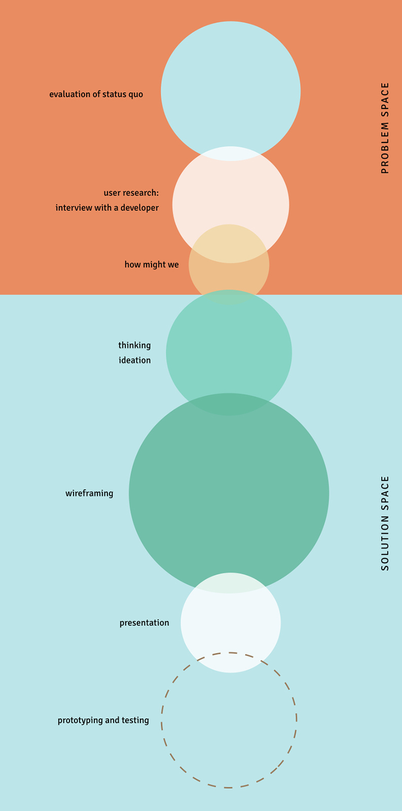
Usually, I like to conduct user research through several qualitative interviews in the start of the problem phase. Because of the time limitations for this challenge, I only did one interview. With the results from my analysis and the user interview, I focused on the most important problems by writing out “how might we” questions.
how might we merge two different platforms into one with accessible navigation?
how might we make the chart controls more user-friendly?
how might we improve the alarm view and connect it to messaging?
how might we reduce the amount of clicks and scrolling?
how might we have maximum customizability?
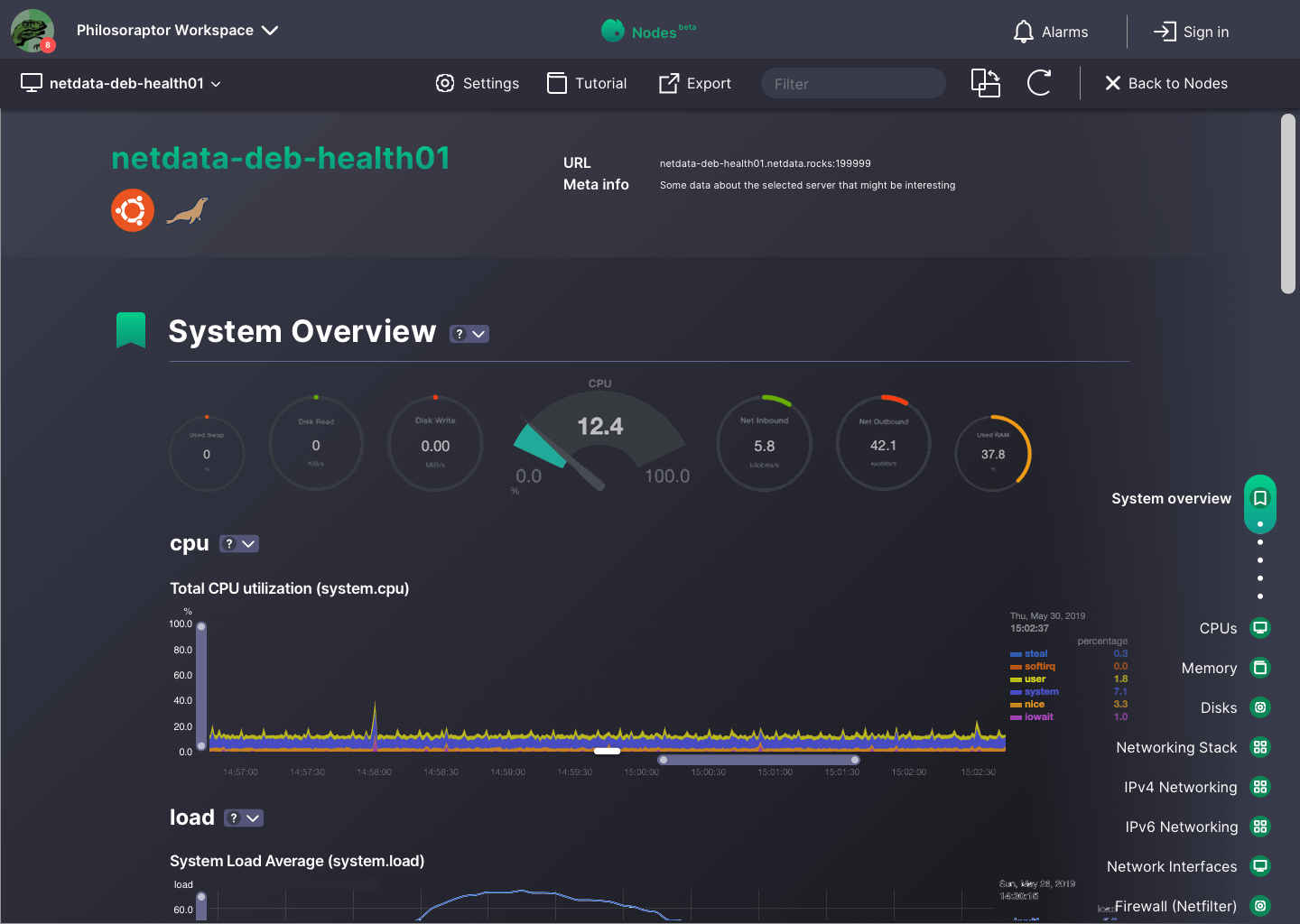
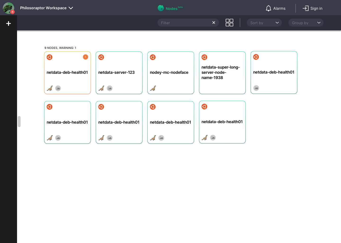
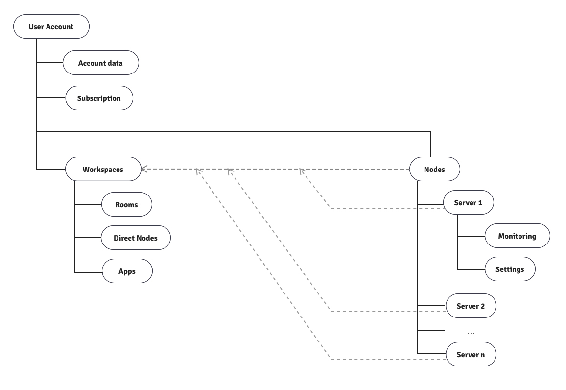
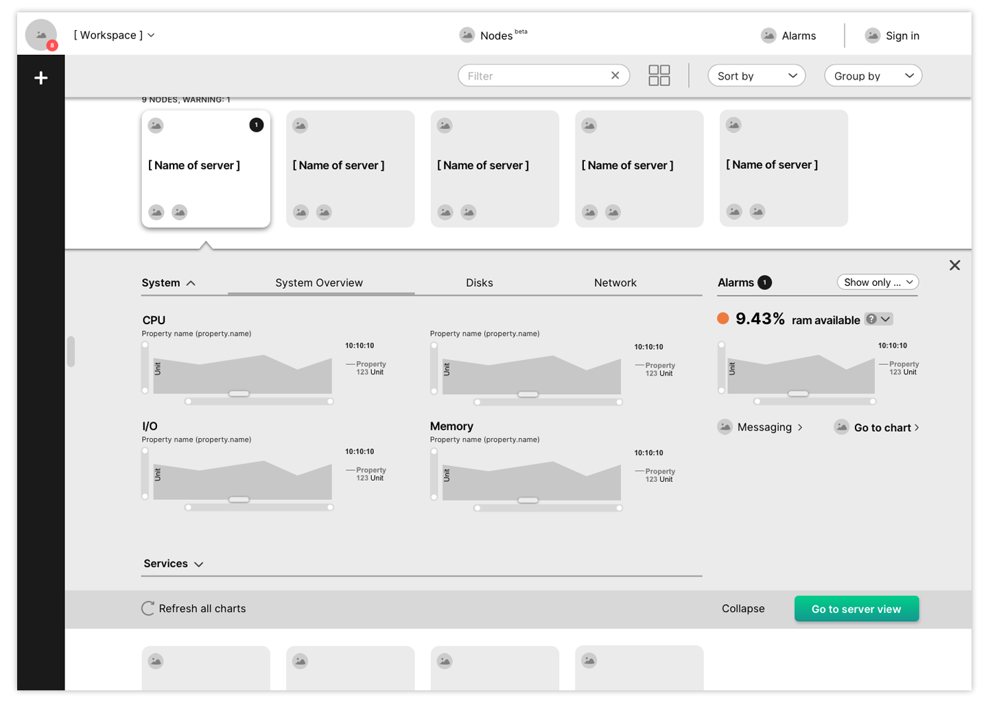
After mapping out an information architecture, it was obvious to me that the two services of single server view and Nodes would have to become one platform. I wanted to have more consistency between the server detail view and the Nodes, so I felt that both systems should have a similar/roughly identical navigation and/or should be integrated.
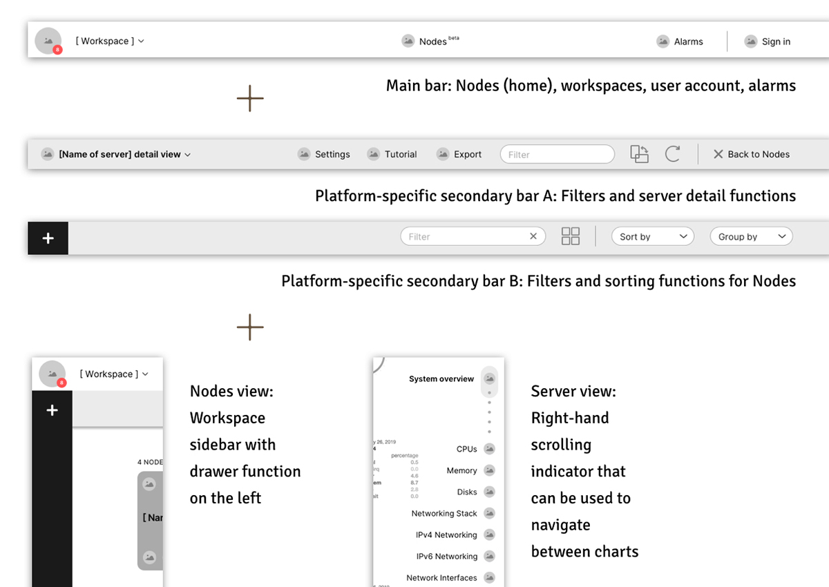
a unified navigation
I tried various navigation styles. The challenge was to merge the principle of top navigation bar with not one, but two side column navigations: the principle of Slack-like left-hand side messaging AND the right-hand side server page navigation. This took a lot of trying and moving elements around, but in the end I settled for the following solution:
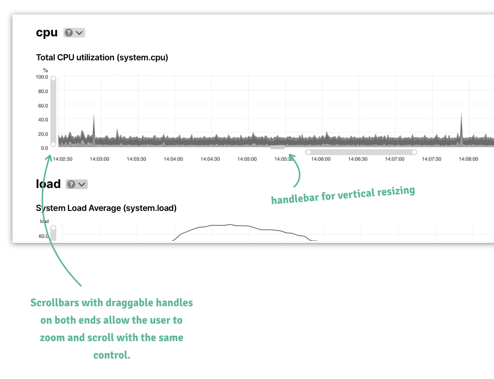
user-friendly chart controls
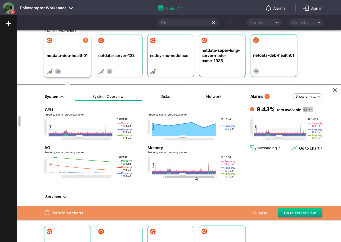
The old chart controls were buttons that did not feel like they were dynamically connected to the charts in real time. This may be a technical issue, but the way the chart controls work now, there is no user feedback, so it feels horrible to use the buttons. Therefore, I added dynamic controls: zoom scrollbars and a handlebar for the vertical sizing of the charts.
To refresh the continuous animation of the charts, I felt like the play button was not understandable and it was weird that every chart had one when you were refreshing all of them. So I added a refresh icon in the navigation bar.
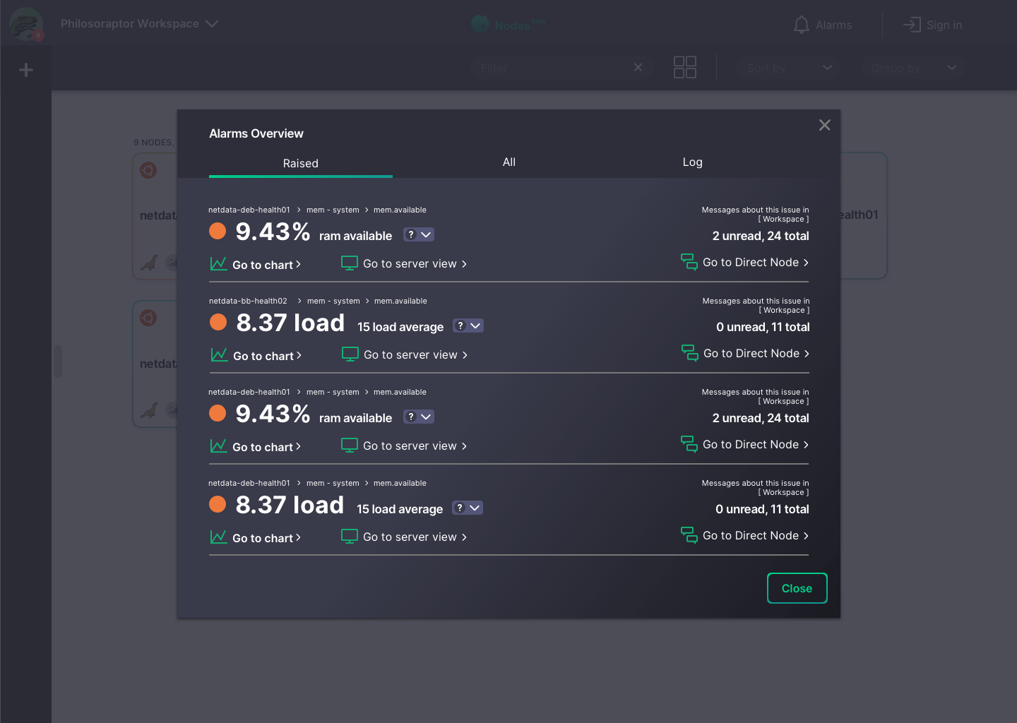
connected alarms and messaging
I thought it was weird that only the server had an alarms window, but the nodes didn’t. So my first action was to give both the server AND the nodes a proper alarm modal window. In order to make the problem more visible, I changed size relations for the display of the problematic server property and added a traffic light system (orange light/red light). Furthermore, I added more visible links for charts, server views and – this is new –, the corresponding thread/channel/direct node (? not sure whether this is correct but I thought this might be the right term) in the Workspaces.

nodes view
Some of the most significant changes I made are in the Nodes tile detail view. I changed the split screen layout to a flyout for the node detail view because I think that the user can see more graphs at once with less scrolling and less tabs this way. I made the alarms permanently visible with an added filter (the filter helped me get rid of the button tabs). For System and Services, I created a combination of accordion and tabbed navigation to avoid two tiers of tabs – I kind of invented this, so would definitely have to be tested for usability.
less clicks and scrolling
My first impulse was a no-scroll slider-like behaviour of the server detail view. This could be used as a presentation tool as well. For that reason, I included a portrait-landscape switcher in the navigation bar. However, this would require lots of customisation and a general change of how the charts behave and I simply did not have the time to really think about this part of the concept because there was so much else to do. Other things you can do for less clicks and scrolling are many tiny things.
- Make good use of space and don’t leave too much vertical whitespace
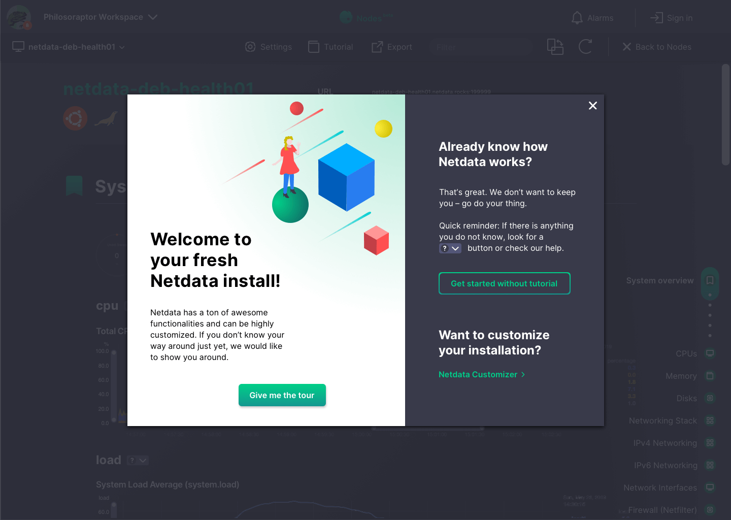
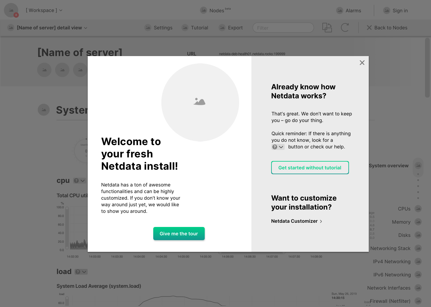
- Reduce the amount of text that users might not always need and add a better tutorial for new users: hide text explanations behind small accordeon buttons
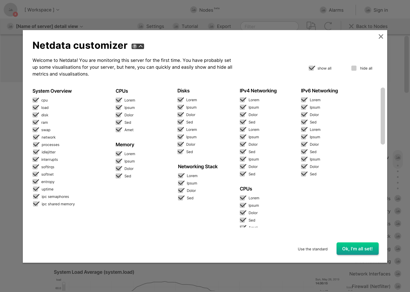
- Add a customizer so that users can turn charts on and off to make the server page shorter if they don’t always need the same metrics
maximise customizability
To make customization as fast as possible, I added a customizer function (would be found under „Settings“ in the navigation). This enables the users to quickly turn added metrics/charts on and off without changing their code. For now, the customizer is rather simple with checkboxes. One could use more time on this to create a dashboard builder, graph customizer and more within this function.